
Product feeds are either a growth asset or a silent tax
If your feed is wrong, you pay for it. Wasted ad spend. Lost impressions. Low-quality clicks that never convert. Most SMEs don’t spot it because the problem hides inside “performance”. But a messy feed is one of the fastest ways to turn paid media into noise. This is fixable. Not with more tweaks. With a simple system you can run: clean data, clear segmentation, and a weekly QA rhythm that keeps your best products eligible, visible, and profitable.
Built around outcomes, not platform scores.
Trust signal to remove friction
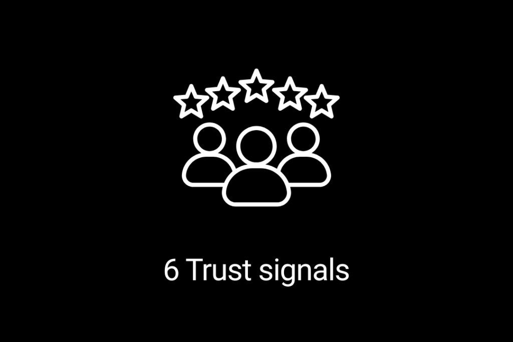
The trust stack: 6 signals that make people buy faster (e-commerce)
E-commerce is a strange business.
You can have a great product.
Strong pricing.
Solid traffic.
And still lose the sale for reasons that have nothing to do with the product itself.
Because online, customers can’t touch, test, or ask a quick question.
So they buy the next best thing.
They buy confidence.
That confidence is created by small signals.
Not big statements.
These are six trust signals that make buying feel easier.
And when buying feels easier, conversion improves.
Six practical things you can add to your website, product pages, and sales process.
1) Clarity: make it obvious what you do
This is where trust starts.
If someone can’t explain what you do after 10 seconds, they won’t buy.
Quick check:
Who is this for?
What problem does it solve?
What outcome do I get?
Fix it by writing one simple line:
“We help [type of customer] achieve [outcome] without [common pain].”
2) Specificity: vague feels risky
People trust specifics.
They don’t trust big claims.
Compare these:
“High quality service and great results.”
vs
“Delivered in 10 working days. Weekly reporting. Clear next steps.”
The second one feels safer.
Because it’s measurable.
3) Proof: evidence beats opinion
If you want people to buy faster, show proof earlier.
Not hidden.
Not buried.
Good proof looks like:
short case studies
numbers (even small ones)
reviews with detail
before/after
real examples
A simple upgrade:
Add one proof block near the top of your key pages.
4) Predictability: make delivery feel safe
Most people don’t fear paying.
They fear hassle.
They want to know:
when will it arrive?
how does delivery work?
what happens if it’s not right?
If that’s unclear, they delay.
Or they leave.
Quick win:
Add a visible block on the product page with:
delivery timeframe
delivery cost
returns policy summary
warranty / guarantee
This reduces doubt fast.
5) Risk reversal: make returns feel easy
Buyers always have the same fear:
“What if it’s not right?”
That’s why returns and guarantees are conversion levers.
Make it simple:
clear returns window
how returns work (in plain English)
who pays return shipping
what condition it needs to be in
If returns feel easy, buying feels safer.
And conversion goes up.
6) Experience: remove checkout friction
This is the silent killer.
If checkout is annoying, people leave.
Common friction points:
too many steps
too many form fields
forced account creation
hidden delivery costs
slow loading on mobile
One simple fix:
Reduce the effort it takes to buy.
Less typing.
Less clicking.
More completion.
The takeaway
Trust isn’t a vibe.
It’s a set of signals.
When you improve these six areas, you usually get:
higher conversion
fewer abandoned carts
less discounting
more repeat purchases
And you don’t need to redesign your whole site.
You just need to remove doubt at the decision point.
One thing to do this week
Pick your top-selling product.
Then make one trust upgrade:
add delivery + returns info near the top
add one proof block above the fold
simplify the option selection
Small changes here compound quickly.
Enjoy this post? Please share!